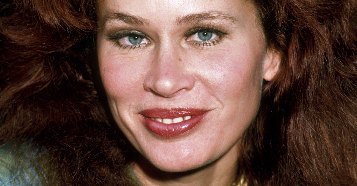

When Albums Were Art
Before streaming reduced album covers to tiny squares on a screen, LP artwork could be almost as important as the music. The 1970s produced some of the medium’s defining images, including covers so familiar that millions of Baby Boomers could probably identify the record without seeing a single word.
Abraxas (1970)
Santana's Abraxas paired the band's Latin-rock breakthrough with Mati Klarwein's fantastical painting Annunciation. The densely detailed, surreal artwork practically demanded examination on a 12-inch LP sleeve. With "Black Magic Woman" and "Oye Como Va" inside, the record became one of Santana's defining releases.
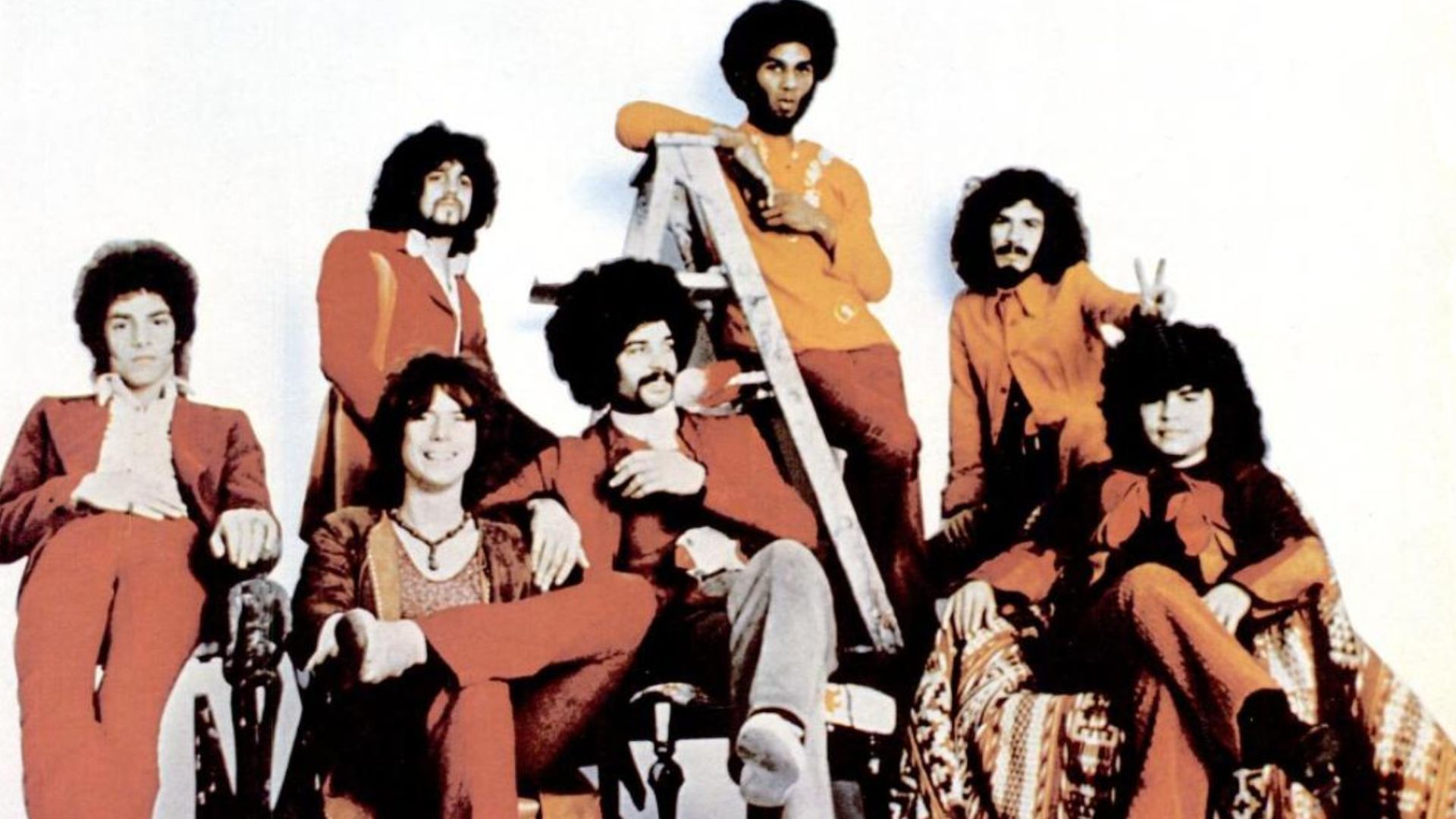 Columbia Records, Wikimedia Commons
Paranoid (1970)
The blurry, sword-wielding figure on Black Sabbath's Paranoid looks almost bizarrely disconnected from the heavy music inside, yet that oddity helped make it memorable. Released before heavy metal had established its visual vocabulary, the album gave listeners "War Pigs," "Iron Man," and the immortal title track.
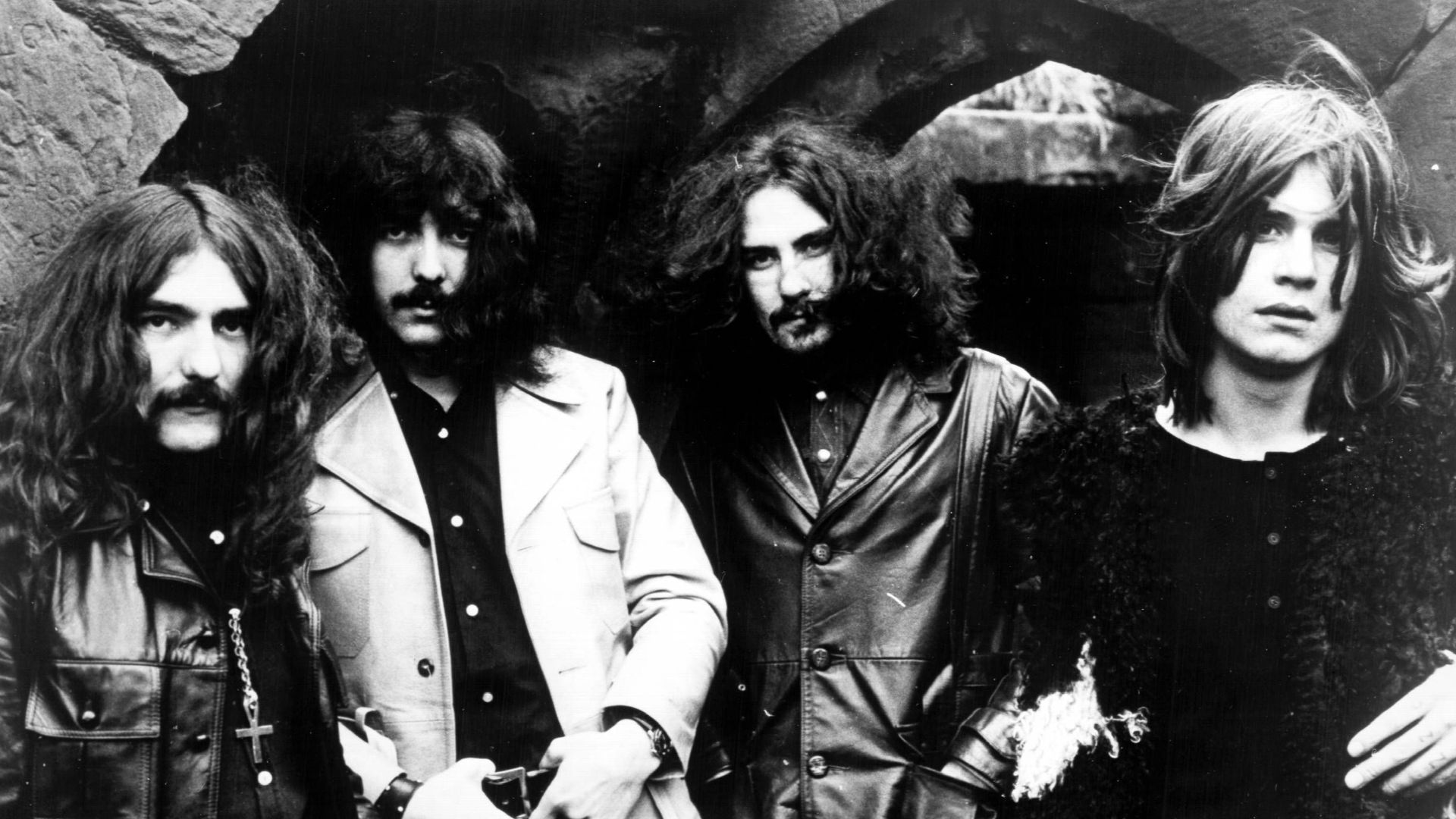 Warner Bros. Records, Wikimedia Commons
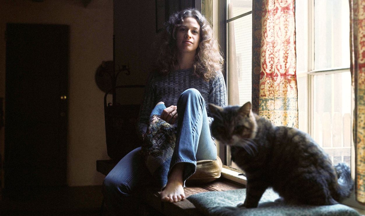
Tapestry (1971)
Carole King's Tapestry offered something completely different: King sitting comfortably at home beside her cat, looking less like a superstar than someone you might actually know. The relaxed Jim McCrary photograph perfectly suited an intimate singer-songwriter landmark that became one of the decade's most beloved records.
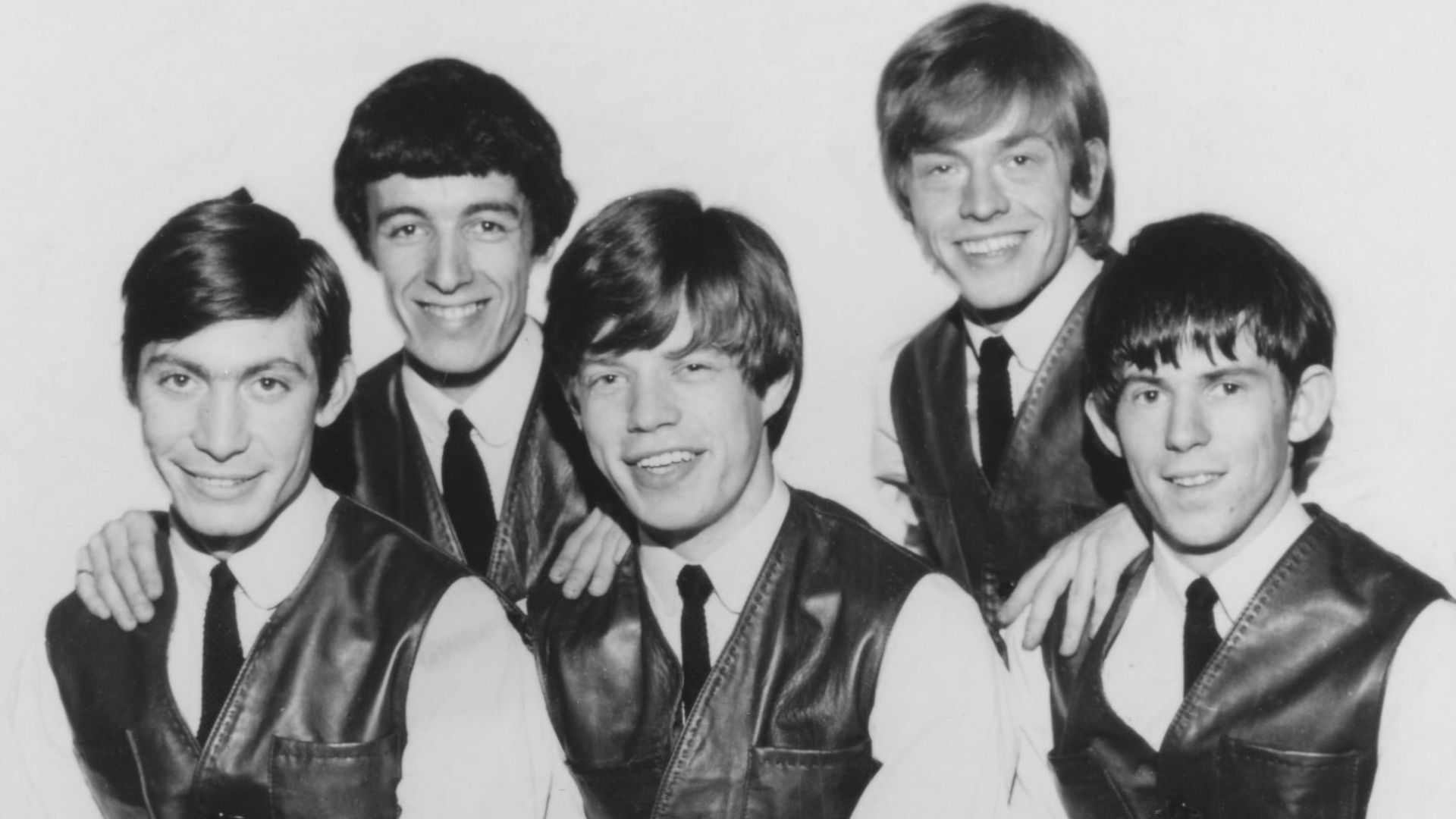
Sticky Fingers (1971)
Few album packages were more tactile than the Rolling Stones' Sticky Fingers. Andy Warhol conceived the provocative jeans image, while original copies incorporated an actual working zipper. The audacious package became inseparable from an album containing "Brown Sugar," "Wild Horses," and the first prominent appearance of the Stones' tongue logo.
Led Zeppelin IV (1971)
No Led Zeppelin. No album title. Just an old image of a man carrying sticks hanging on a deteriorating wall. The refusal to identify the band was astonishingly confident, but with "Black Dog," "Rock and Roll," "When the Levee Breaks," and "Stairway to Heaven" inside, identification soon became unnecessary.
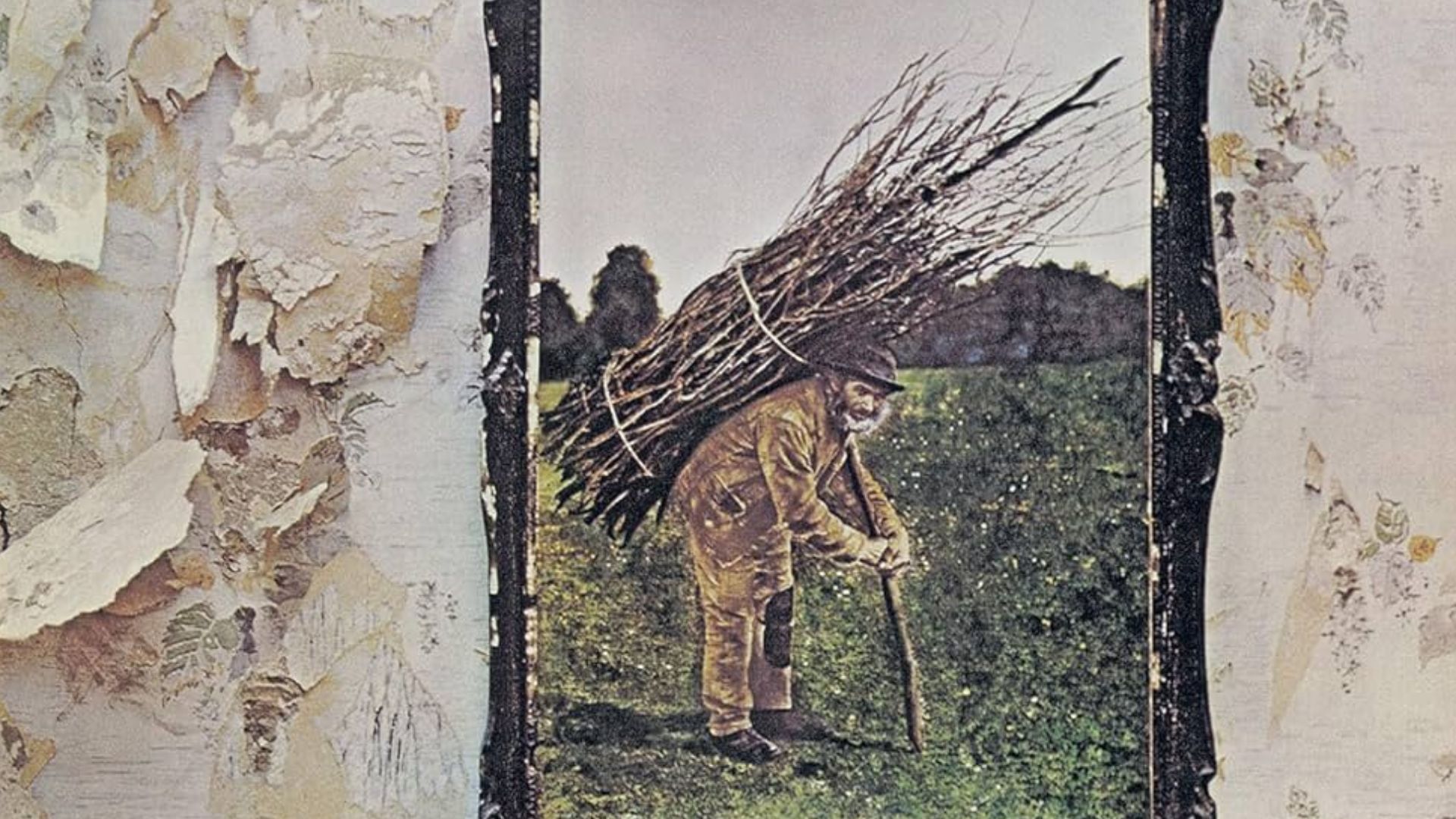 Led Zeppelin, Wikimedia Commons
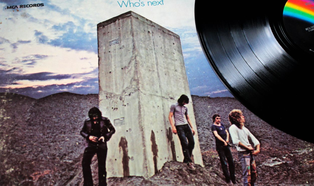
Who’s Next (1971)
The Who gave rock fans one of the decade's cheekiest visual jokes with Who's Next. Roger Daltrey, Pete Townshend, John Entwistle, and Keith Moon appear beside a concrete monolith, having apparently just relieved themselves on it. The image became attached to classics including "Baba O'Riley" and "Won't Get Fooled Again."
What’s Going On (1971)
Marvin Gaye stands outside in the rain on the cover of What's Going On, his face turned thoughtfully away from the camera. The understated image suited a record tackling war, poverty, environmental destruction, and social upheaval while transforming Gaye from Motown hitmaker into an artist exercising extraordinary creative control.
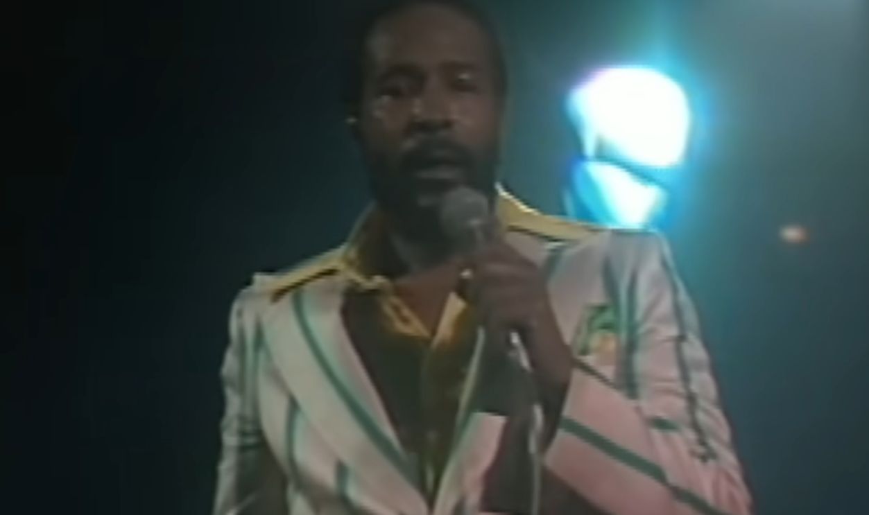 Screenshot from What’s Going On, Tamla Records (1971)
Blue (1971)
Joni Mitchell's face is barely recognizable in the deeply blue photograph adorning Blue, yet the image became an ideal visual expression of the vulnerable music within. The stark cover offered no visual distractions from one of the singer-songwriter era's most intimate and influential collections of songs.
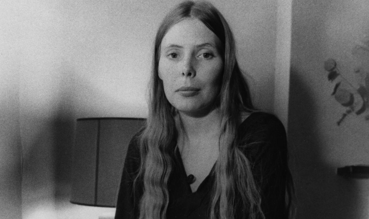
The Rise And Fall Of Ziggy Stardust And The Spiders From Mars (1972)
David Bowie standing beneath the K. West sign on a gloomy London street became one of glam rock's defining images. The photograph doesn't look especially extraterrestrial, which somehow makes it even better: Ziggy Stardust appears to have simply arrived on Earth and wandered into an ordinary city neighborhood.
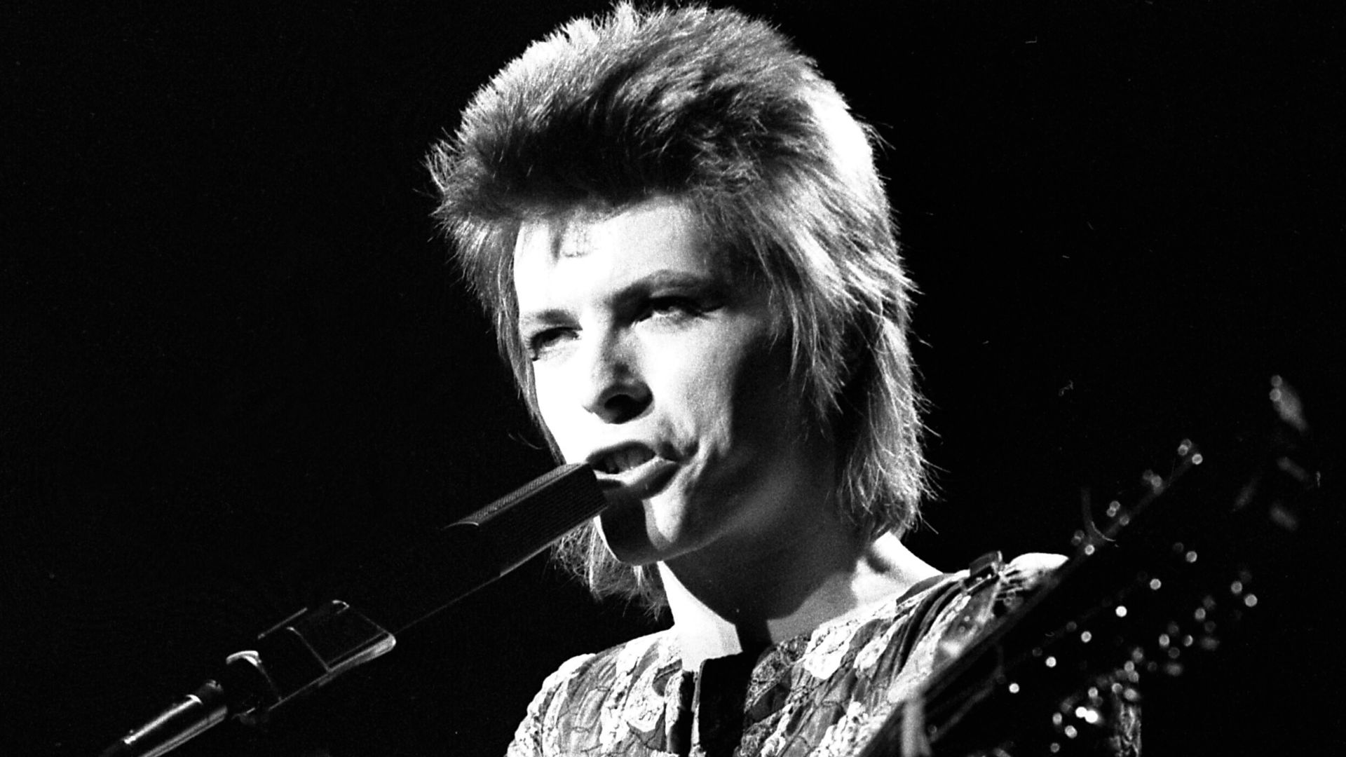
The Dark Side Of The Moon (1973)
You barely need to be a Pink Floyd fan to recognize it. Hipgnosis and George Hardie's simple prism transforming white light into a rainbow became one of popular culture's most reproduced designs. Crucially, neither Pink Floyd's name nor the album title was needed on the front.
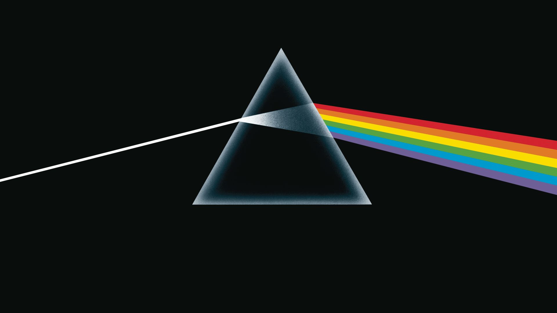 w:George Hardie (artist), Wikimedia Commons
Aladdin Sane (1973)
Few portraits have become more closely associated with a musician than Brian Duffy's image of David Bowie with a red-and-blue lightning bolt bisecting his face. Created as Bowie grappled with sudden superstardom, the Aladdin Sane portrait became so famous that it eventually transcended the album itself.
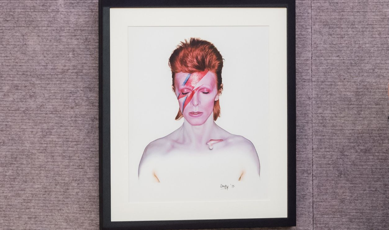 Wiktor Szymanowicz, Getty Images
Houses Of The Holy (1973)
Hipgnosis gave Led Zeppelin another wordless cover, this time depicting strangely colored figures climbing across the Giant's Causeway in Northern Ireland. Inspired partly by Arthur C. Clarke's Childhood's End, the eerie image made Houses of the Holy immediately recognizable even without the band's name appearing on the original sleeve.
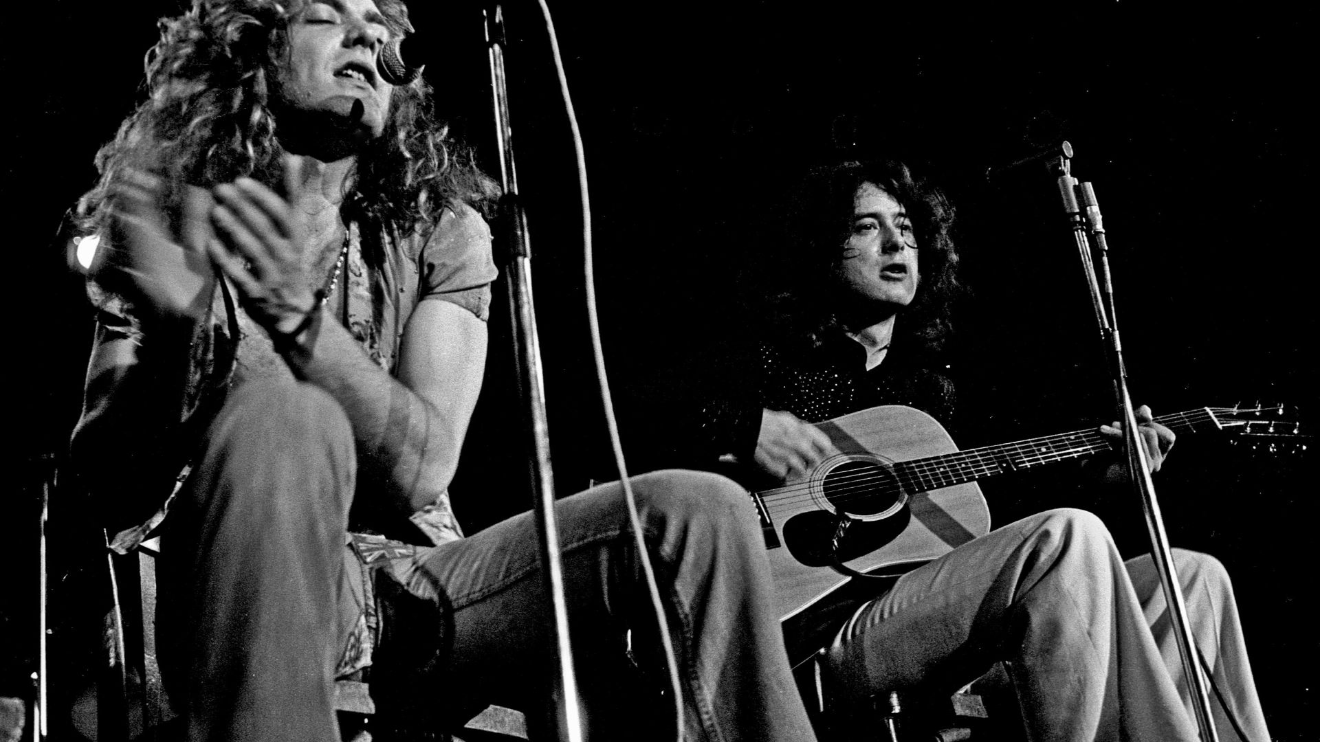 Heinrich Klaffs, Wikimedia Commons
Goodbye Yellow Brick Road (1973)
Elton John's flamboyant double album received appropriately extravagant artwork. Ian Beck's illustration shows Elton stepping through a poster and onto the yellow brick road, connecting the title to The Wizard of Oz. The album itself delivered "Bennie and the Jets," "Saturday Night's Alright for Fighting," and "Candle in the Wind."
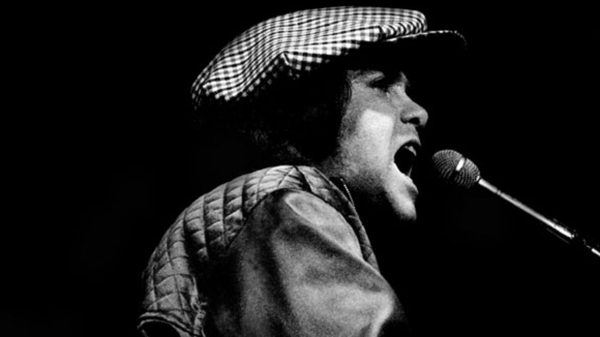
Band On The Run (1973)
Paul McCartney and Wings turned an album cover into a celebrity lineup. McCartney, Linda McCartney, Denny Laine, James Coburn, Christopher Lee, and others pose as escaped prisoners caught in a spotlight. The unusual tableau became almost as recognizable as the hugely successful album's title song.
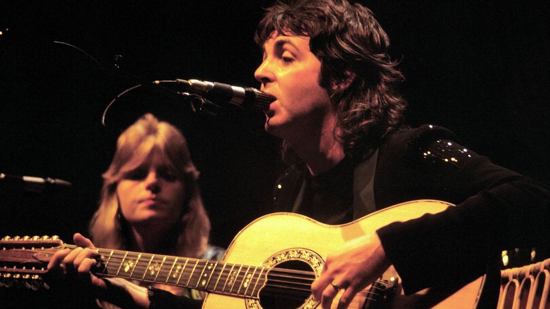 Jim Summaria, Wikimedia Commons
Wish You Were Here (1975)
Pink Floyd and Hipgnosis followed their famous prism with another unforgettable concept. Two businessmen shake hands outside a movie studio while one is literally on fire, an image representing insincerity and the fear of getting burned. Original copies made things stranger by concealing the artwork beneath dark shrink-wrap.
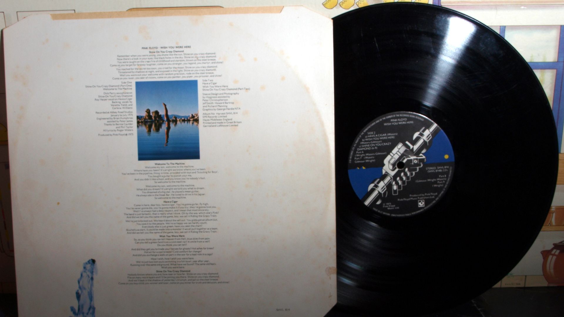 badgreeb RECORDS from ENGLAND, Wikimedia Commons
Physical Graffiti (1975)
Led Zeppelin transformed two New York apartment buildings into an interactive LP package for Physical Graffiti. Die-cut windows in the outer sleeve revealed different images beneath, depending upon how the inner sleeves were positioned. It was precisely the sort of elaborate physical presentation that made the vinyl era special.
 Nestor Galina, Wikimedia Commons
Born To Run (1975)
Eric Meola's black-and-white photograph of Bruce Springsteen leaning against saxophonist Clarence Clemons captured both friendship and musical partnership. Open the gatefold and the complete pose appears. The image helped establish Springsteen's visual identity just as the record transformed him from critical favorite into a major rock star.
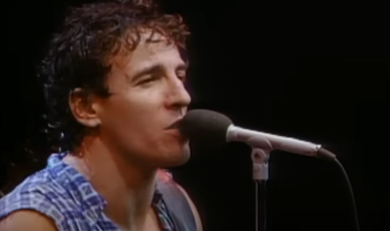 Screenshot from Born to Run, Columbia Records (1975)
A Night At The Opera (1975)
Queen surrounded its familiar crest with an expanse of brilliant white for A Night at the Opera. Freddie Mercury had designed the original Queen emblem around the band members' zodiac signs. By 1975, it was strong enough to carry the cover of the album containing "Bohemian Rhapsody."
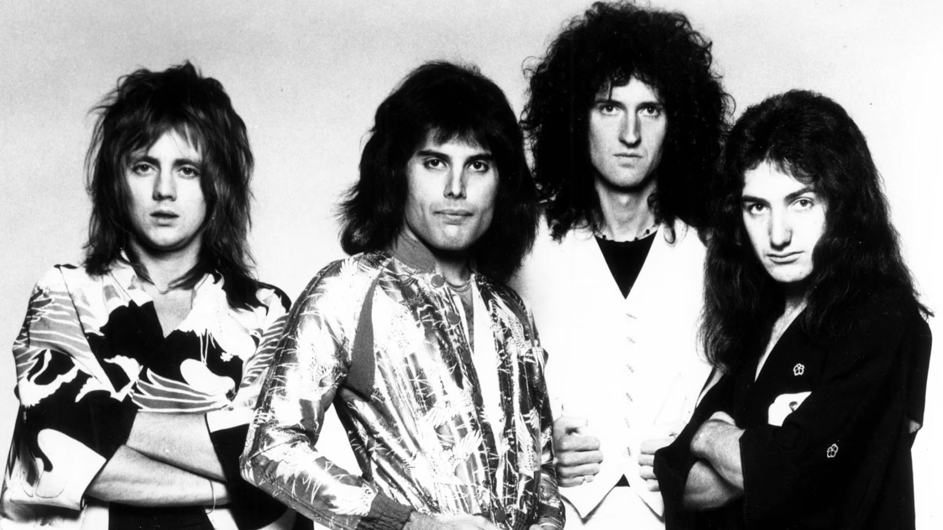 Koh Hasebe; Distributed by Elektra Records, Wikimedia Commons
Hotel California (1976)
A sunset photograph of the Beverly Hills Hotel became forever linked with the Eagles after appearing on Hotel California. The warmly illuminated building initially looks inviting, although the album's darker themes give it another dimension. The record went on to become one of the decade's enormous commercial successes.
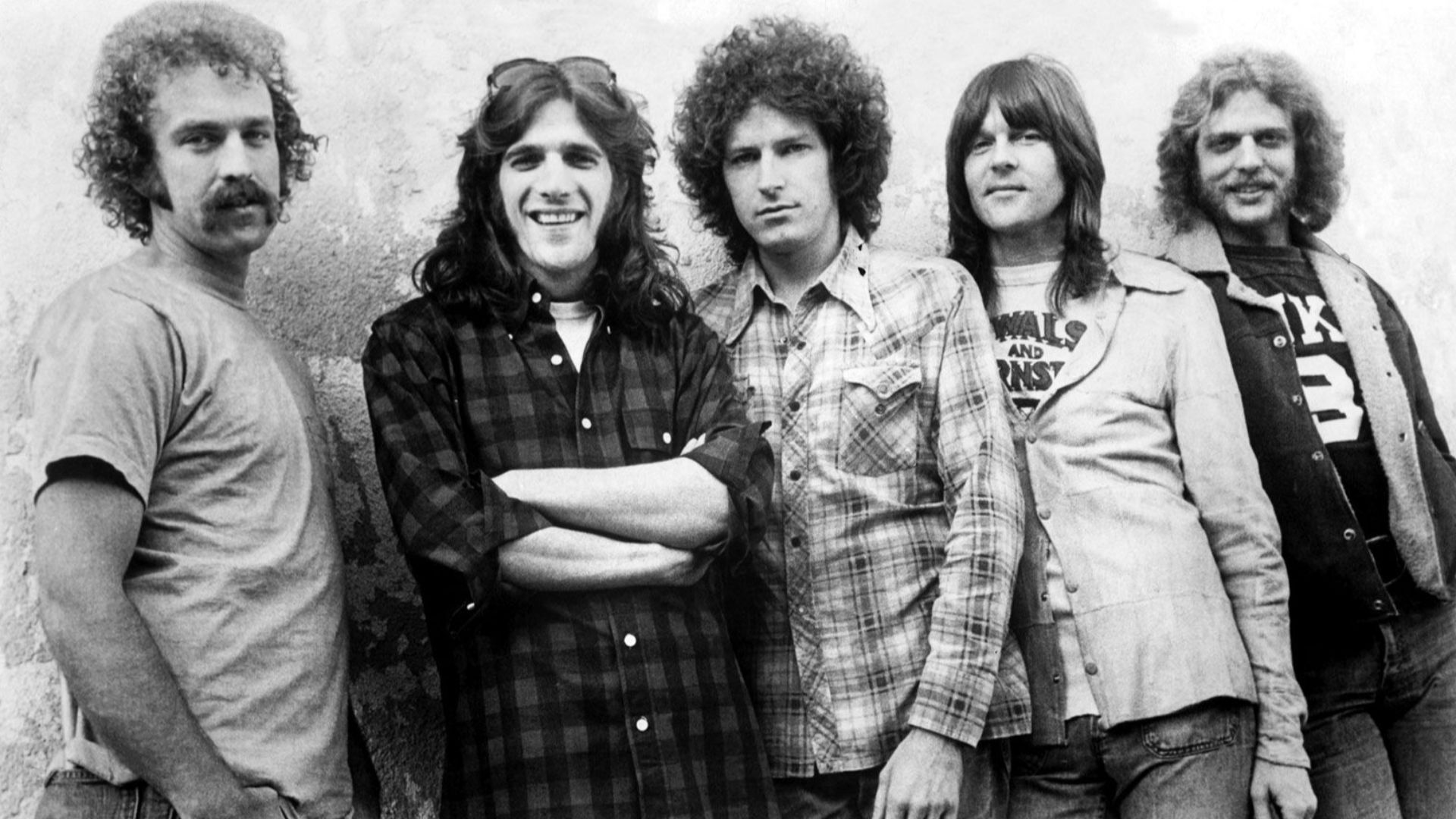 Distributed by Asylum Records, Wikimedia Commons
Boston (1976)
A guitar-shaped spaceship escaping an exploding planet sounds gloriously ridiculous, but it gave Boston's debut exactly the larger-than-life image it needed. Artist Roger Huyssen's science-fiction artwork became the template for subsequent Boston covers, while the record itself produced staples including "More Than a Feeling" and "Peace of Mind."
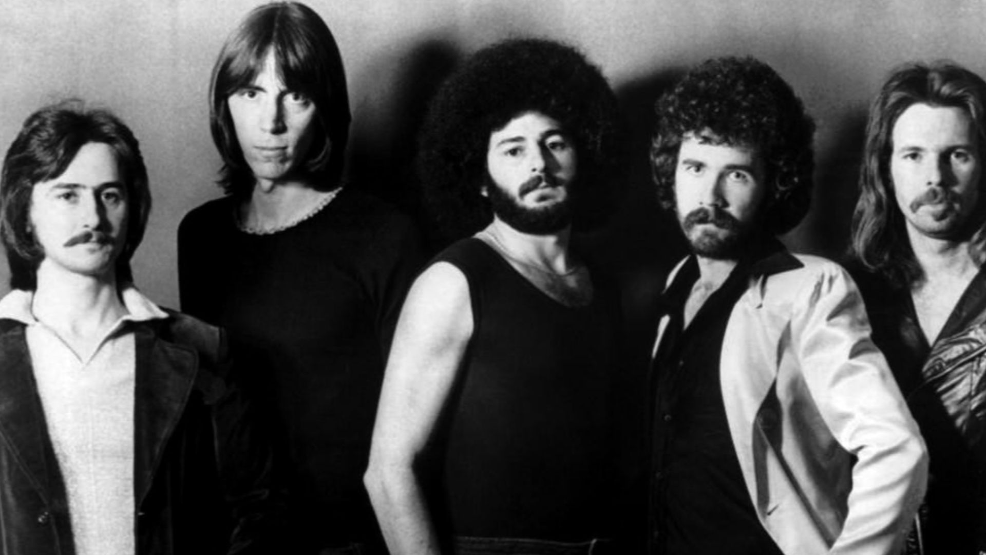 Premier Talent Associates (management company), Wikimedia Commons
Songs In The Key Of Life (1976)
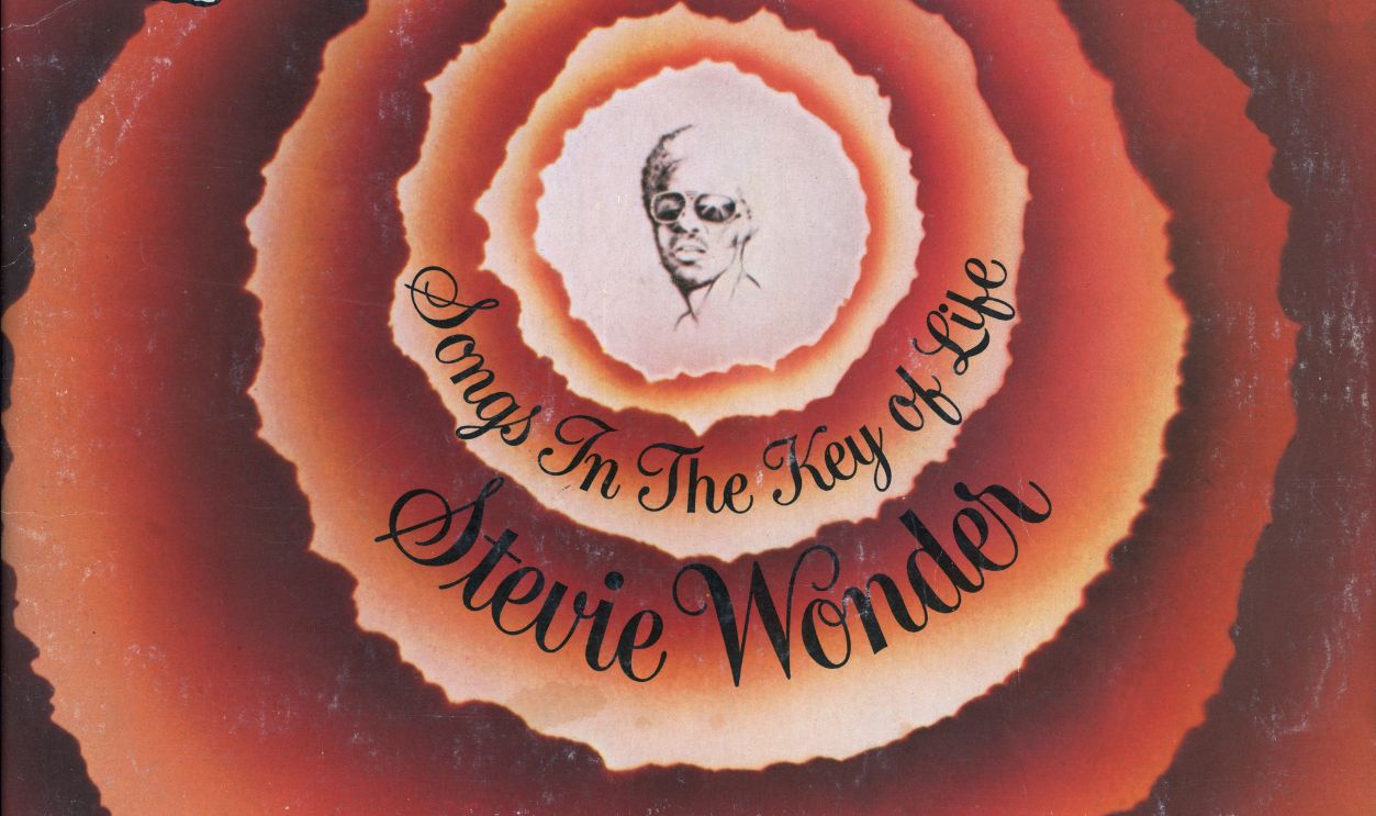
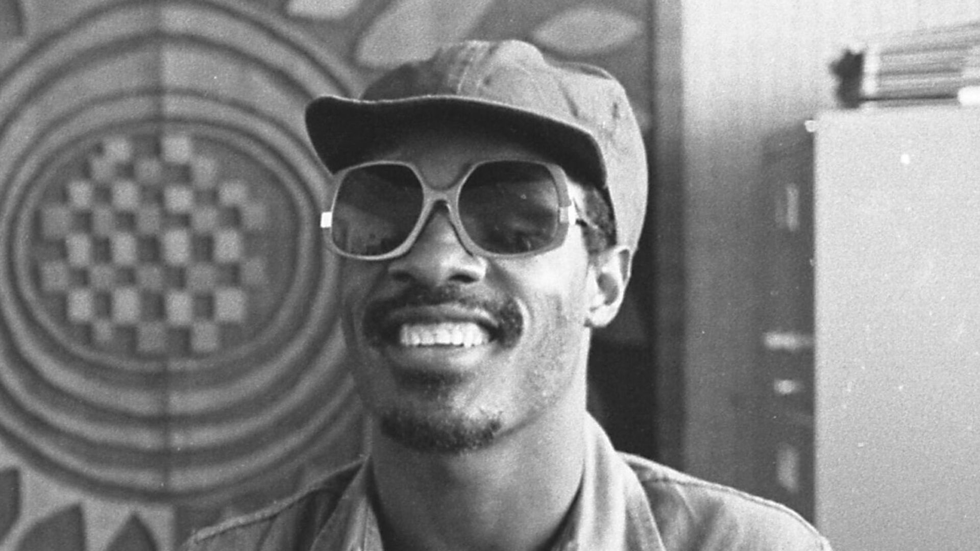
Stevie Wonder's Songs in the Key of Life uses a relatively simple visual idea: Wonder's face emerging from concentric rings of earthy orange and brown. The double LP became one of his defining achievements, making that distinctive swirling design instantly familiar to anyone who bought records during the period.
Rumours (1977)
Mick Fleetwood stands with one foot raised while Stevie Nicks poses in her flowing Rhiannon stage costume. Herbert Worthington's deliberately theatrical photograph seems perfectly suited to an album created amid extraordinary romantic turmoil within Fleetwood Mac. Rumours subsequently became one of the decade's biggest-selling records.
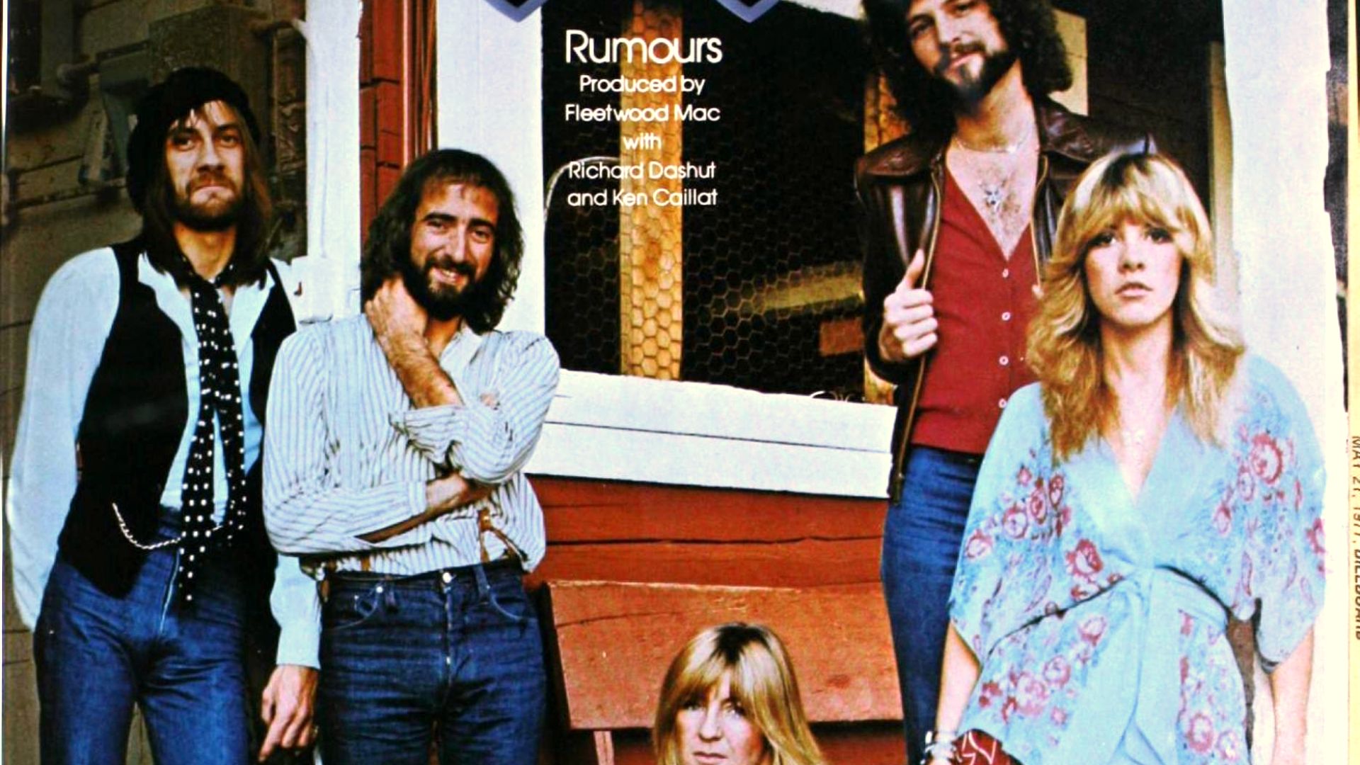 Warner Bros. Records, Wikimedia Commons
Bat Out Of Hell (1977)
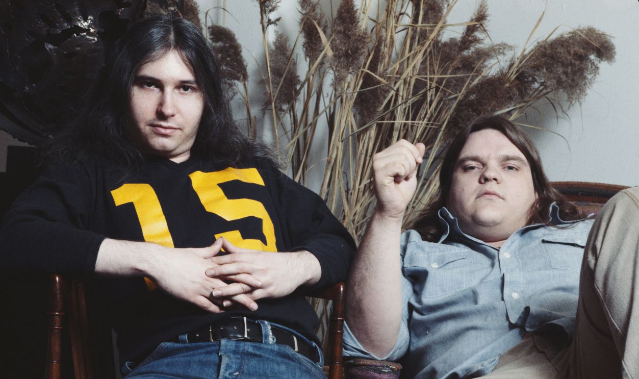
Artist Richard Corben apparently decided subtlety had no place on a Meat Loaf album. A muscular biker erupts from a grave on a motorcycle while an enormous bat watches from above. The gloriously excessive fantasy perfectly matched Jim Steinman's songs and one of the decade's phenomenal slow-burning commercial successes.
News Of The World (1977)
Queen found its giant robot on the cover of a 1953 science-fiction magazine. Artist Frank Kelly Freas adapted his original illustration so the grieving mechanical giant was now holding the dead members of Queen. The unsettling image accompanied an album containing "We Will Rock You" and "We Are the Champions."
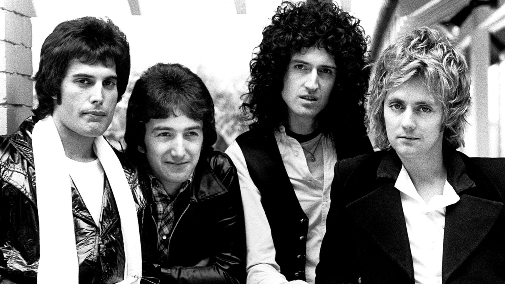 Christopher Hopper; distributed by Elektra Records, Wikimedia Commons
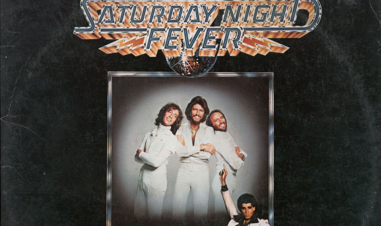
Saturday Night Fever (1977)
John Travolta in his white suit, striking a pose beneath a disco ball, became shorthand for an entire cultural moment. The Saturday Night Fever soundtrack was dominated by the Bee Gees and became a colossal international seller, carrying disco farther into mainstream popular culture than almost any other record.
Out Of The Blue (1977)
Electric Light Orchestra gave its double album Out of the Blue one of the decade’s most elaborate pieces of rock imagery. The enormous ELO spaceship, designed by Kosh with artwork by Shusei Nagaoka, transformed the band’s familiar jukebox-shaped logo into a spectacular spacecraft. The image became inseparable from an album featuring “Turn to Stone,” “Sweet Talkin’ Woman,” and “Mr. Blue Sky.”
 United Artists Records, Wikimedia Commons
Some Girls (1978)
The Rolling Stones turned a vintage wig advertisement into something considerably stranger for Some Girls. Die-cut openings allowed faces printed on the inner sleeve to appear beneath different hairstyles. Early copies controversially included recognizable celebrities, prompting alterations, but the garish colors and bizarre salon imagery remained unforgettable.
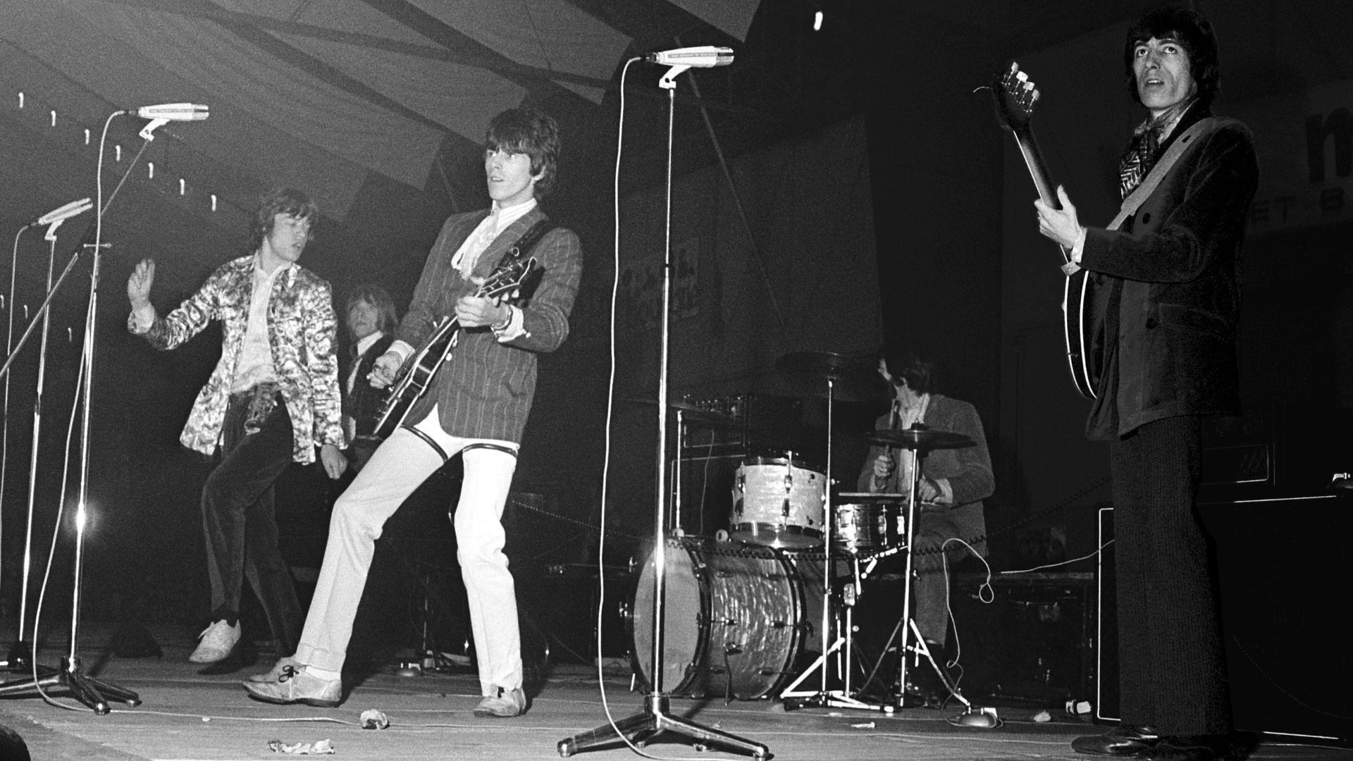 Ben Merk (ANEFO), Wikimedia Commons
Parallel Lines (1978)
Blondie's Parallel Lines stripped things down to black, white, and attitude. Debbie Harry stands out in a white dress while the five male band members wear black suits against alternating vertical stripes. The clean design became inseparable from the album that propelled Blondie into international pop-rock stardom.
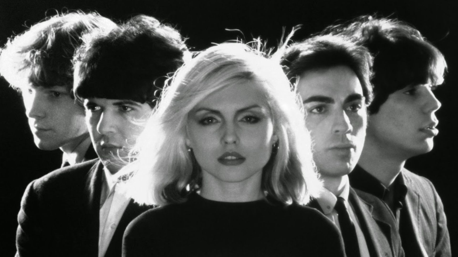 Private Stock Records, Wikimedia Commons
Breakfast In America (1979)
Supertramp turned Manhattan into breakfast. Actress Kate Murtagh poses as a diner waitress holding orange juice while dishes, cartons, and kitchen utensils recreate the New York skyline behind her. The wonderfully elaborate Mick Haggerty and Mike Doud concept won the Grammy for Best Recording Package.
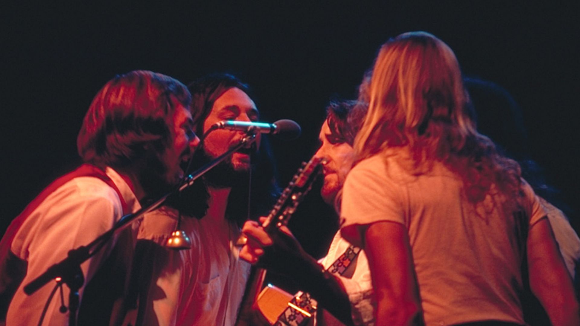
Off The Wall (1979)
Michael Jackson's tuxedo-clad body dominates Off the Wall, but the original sleeve famously crops his head almost entirely from the front-cover composition. The sparkling socks and black-and-white outfit became attached to the record that established the adult Jackson as a major solo artist before Thriller changed everything.
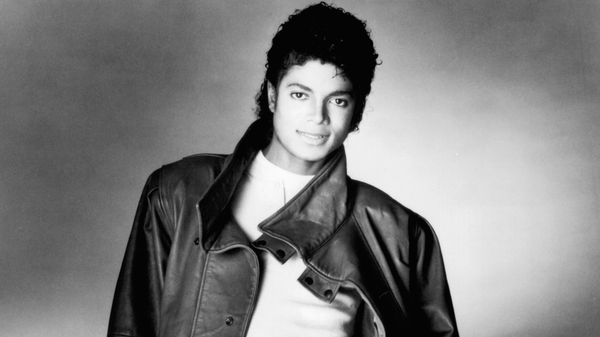 Matthew Rolston; Distributed by Epic Records, Wikimedia Commons
The Wall (1979)
Pink Floyd ended the decade with perhaps the ultimate example of a famous album cover requiring almost nothing. Gerald Scarfe's original design consisted essentially of a plain white brick wall, with the band name and title appearing on a removable sticker rather than as part of the artwork itself.
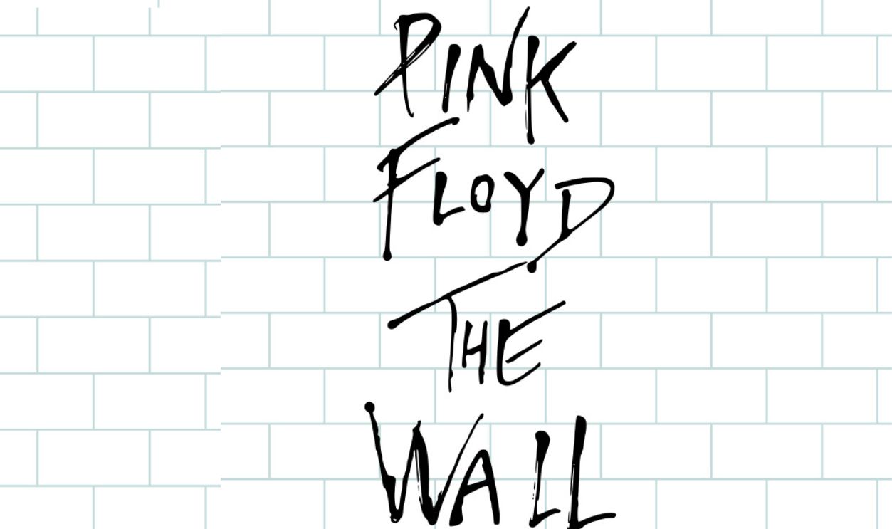 Pink Floyd / Reproduction : Kilyann Le Hen, Wikimedia Commons
London Calling (1979)
Pennie Smith photographed Clash bassist Paul Simonon smashing his bass onstage in New York, while Ray Lowry surrounded the image with lettering deliberately modeled after Elvis Presley's debut LP. The combination of rock history and punk fury created one of the most celebrated covers ever made.
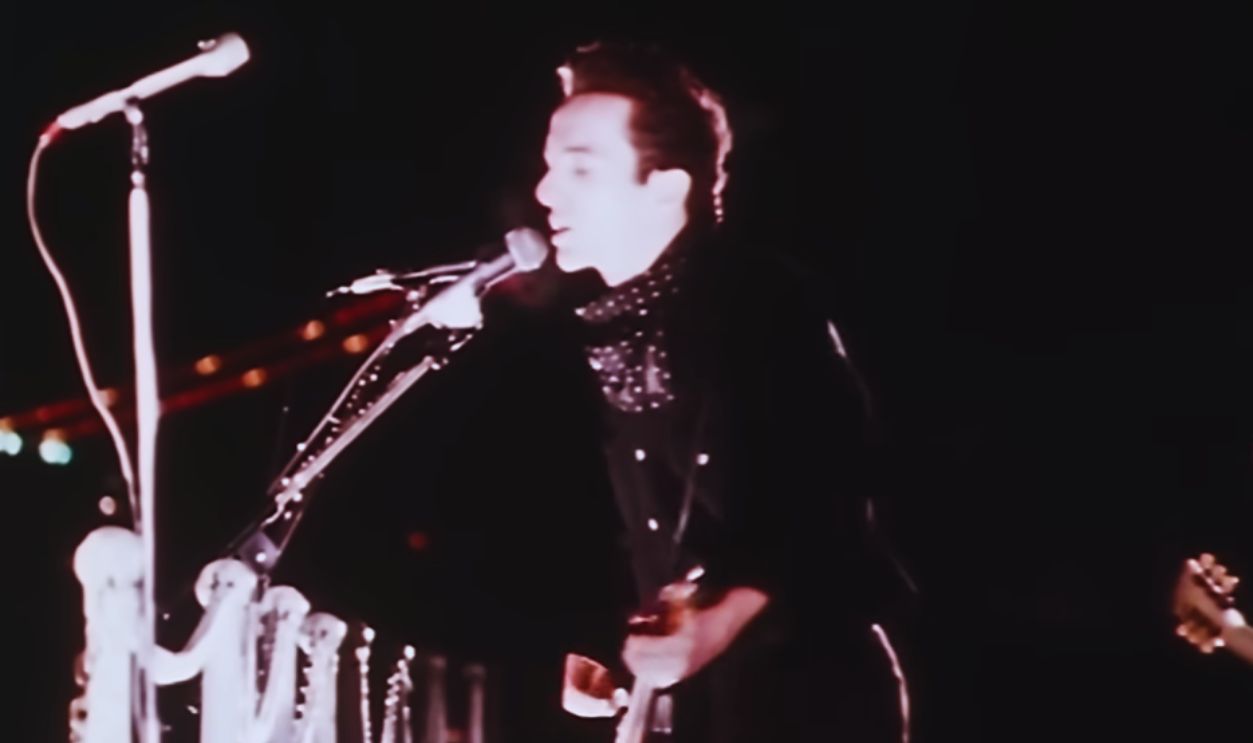 Screenshot from London Calling, Sony Music Entertainment (1979)
Breakfast, Prisms And Zippers
Taken together, these covers show why the 1970s were such a remarkable period for album artwork. Some relied on elaborate photography, others on paintings, die-cuts, working zippers or almost radical simplicity. Several became so familiar that removing the artist's name barely mattered. The picture itself told you what record you were holding.
 UCLA digital library, Wikimedia Commons
You May Also Like:
Critics Say These Rock Albums Don’t Have Any Weak Tracks—Do You Agree?
Forget The Critics: These Are The 50 Greatest Rock Albums Of The 1970s—Do You Agree?