The Decade When Album Art Was Everywhere
Before streaming reduced albums to tiny squares on a phone, record covers were practically pieces of furniture. These 30 sleeves were mysterious, glamorous, funny, unsettling, and sometimes completely ridiculous. How many can you recognize without reading the title?
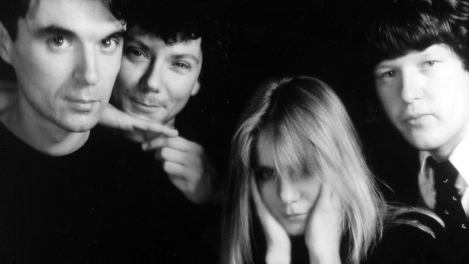
Remain in Light — Talking Heads
Four expressionless faces stare forward beneath a layer of harsh red digital distortion. Talking Heads released Remain in Light in 1980, when computer-altered imagery still looked strange and futuristic. The unsettling portraits perfectly matched an album that seemed determined to scramble rock music into something entirely new.
 Distributed by Sire Records. Photographer uncredited., Wikimedia Commons
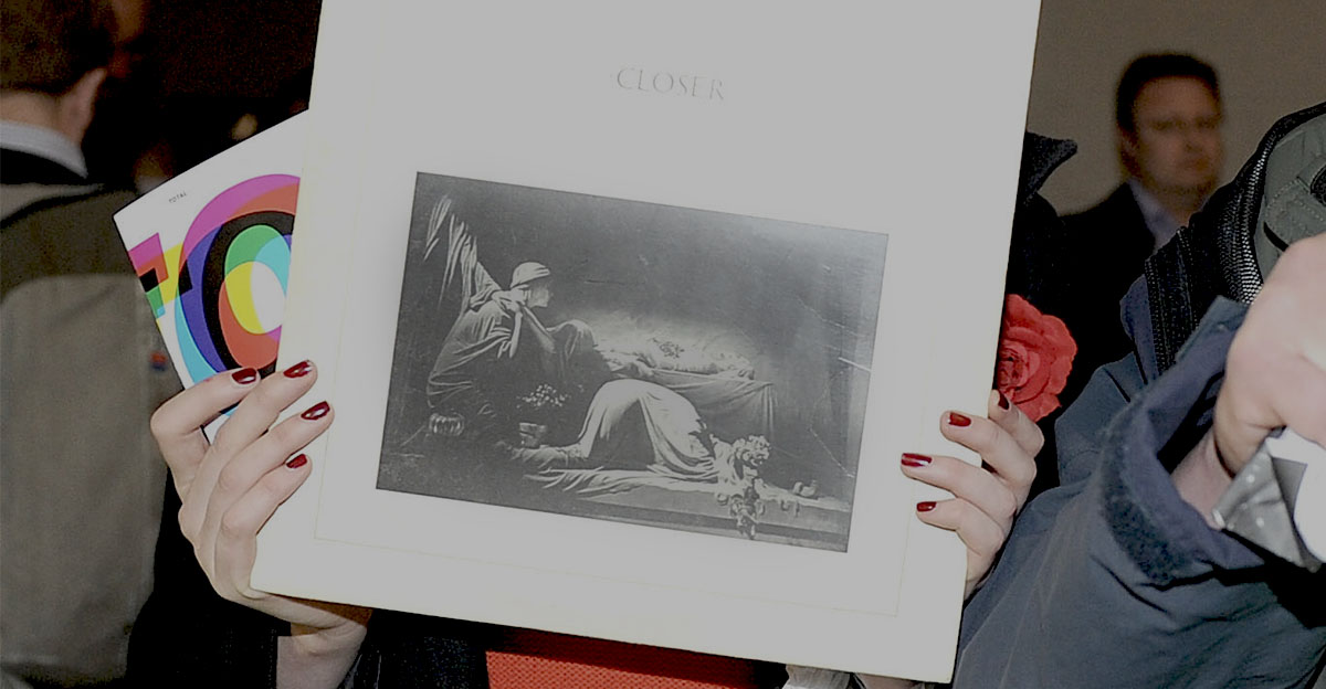
Closer — Joy Division
Joy Division’s Closer features Bernard Pierre Wolff’s photograph of the Appiani family tomb at Genoa’s Monumental Cemetery of Staglieno. Designed by Peter Saville Associates, the mournful black-and-white cover became even more haunting after singer Ian Curtis died shortly before the album’s release in July 1980.
 Shirlaine Forrest, Getty Images
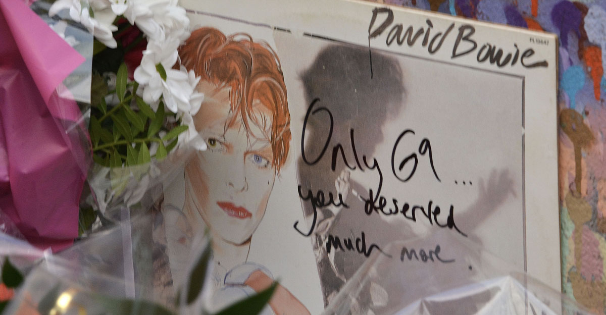
Scary Monsters (and Super Creeps) — David Bowie
David Bowie appears as a damaged, melancholy Pierrot clown on the cover of Scary Monsters, surrounded by sketchy lines and torn-looking textures. Edward Bell combined Brian Duffy’s photography with painted elements, creating an image that felt elegant and slightly unhinged. In other words, it looked exactly like Bowie should.
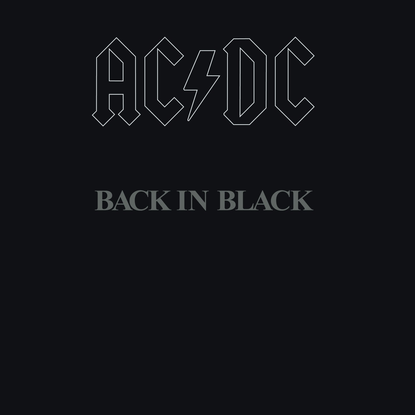
Back in Black — AC/DC
After Bon Scott’s death, AC/DC returned with one of the simplest covers imaginable: the band’s logo and album title embossed against solid black. The restrained design functioned as a memorial while creating an unmistakable visual identity. No fire, lightning, or school uniforms were necessary. Black said everything.
 Angus Young (concept), Wikimedia Commons
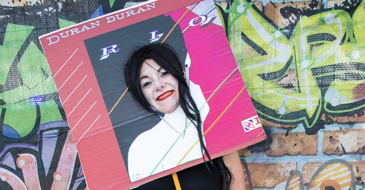
Rio — Duran Duran
Patrick Nagel’s illustration of a glamorous woman with dark hair, red lips, and an enormous smile became one of the defining images of 1980s pop. Designer Malcolm Garrett gave the artwork its distinctive frame and lettering. Spot that face from across a record store and you immediately hear synthesizers.
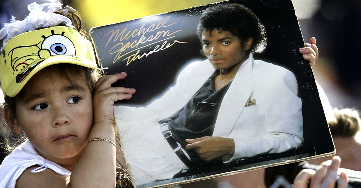
Thriller — Michael Jackson
Michael Jackson reclines in a white suit against a dark background, looking remarkably calm for someone about to release the bestselling album in history. Photographer Dick Zimmerman created a portrait that was clean, polished, and instantly approachable. Unlike the album’s most famous video, there was not a zombie in sight.
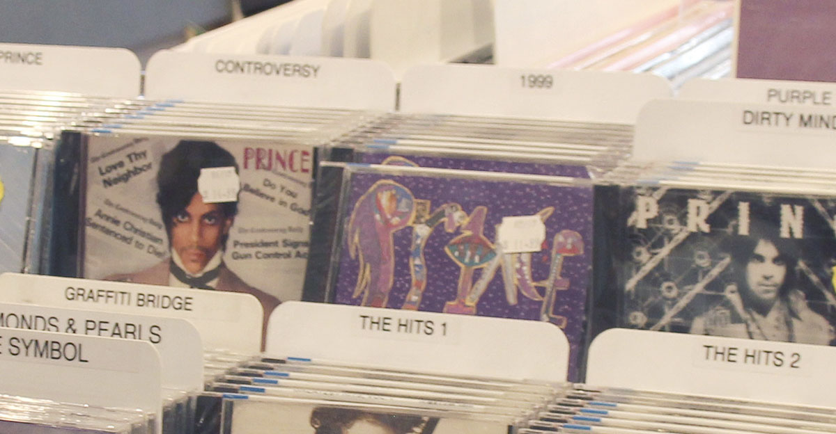
1999 — Prince
Prince designed the busy, hand-drawn cover of 1999, filling it with eyes, clouds, buttons, hidden faces, and oddly shaped lettering. It looks like a notebook doodled in during the world’s funkiest math class. The chaotic artwork matched an album that turned fears about nuclear destruction into an irresistible party.
 picture alliance, Getty Images
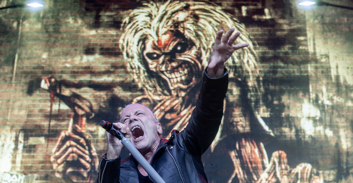
The Number of the Beast — Iron Maiden
Derek Riggs painted mascot Eddie controlling the Devil like a puppet, while an even larger demonic figure appears to control Eddie. The fiery scene was originally intended for a single before the band saved it for the 1982 album. Heavy-metal subtlety had officially left the building.
 Europa Press News, Getty Images
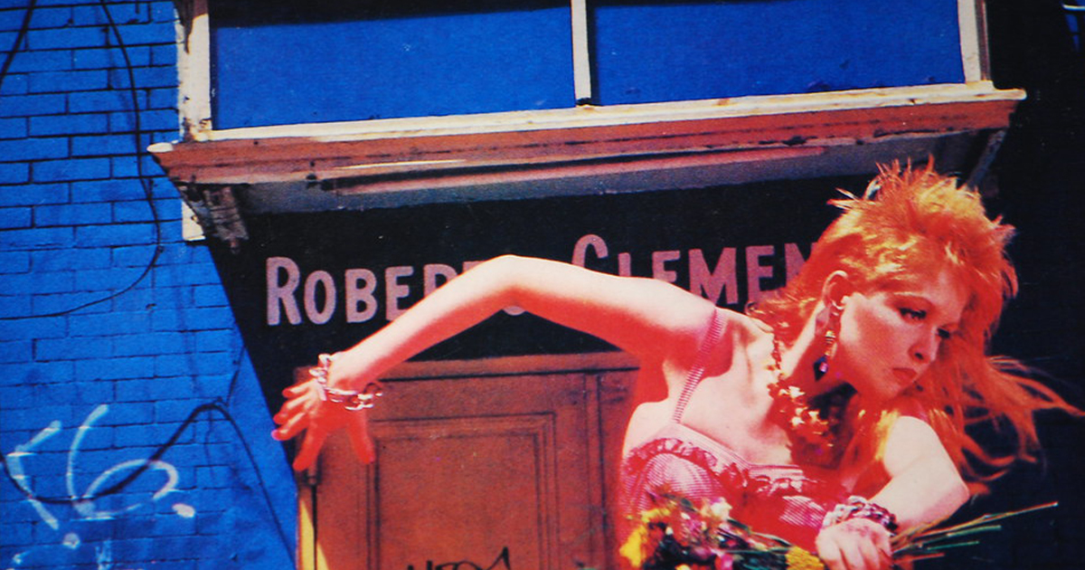
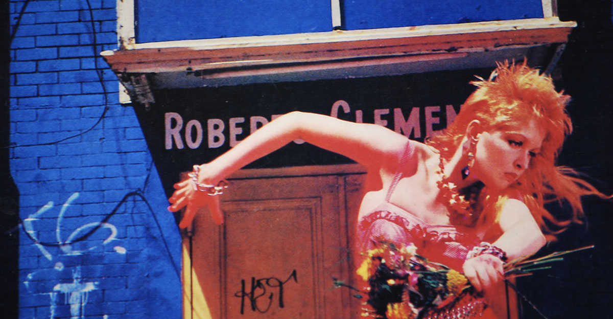
She’s So Unusual — Cyndi Lauper
Cyndi Lauper dances barefoot along a boardwalk in a vivid red dress, surrounded by saturated colors and deliberately crooked energy. Photographer Annie Leibovitz shot the image at Coney Island. The cover captured Lauper’s playful style so perfectly that one glance still makes the album feel loud, cheerful, and wonderfully rebellious.
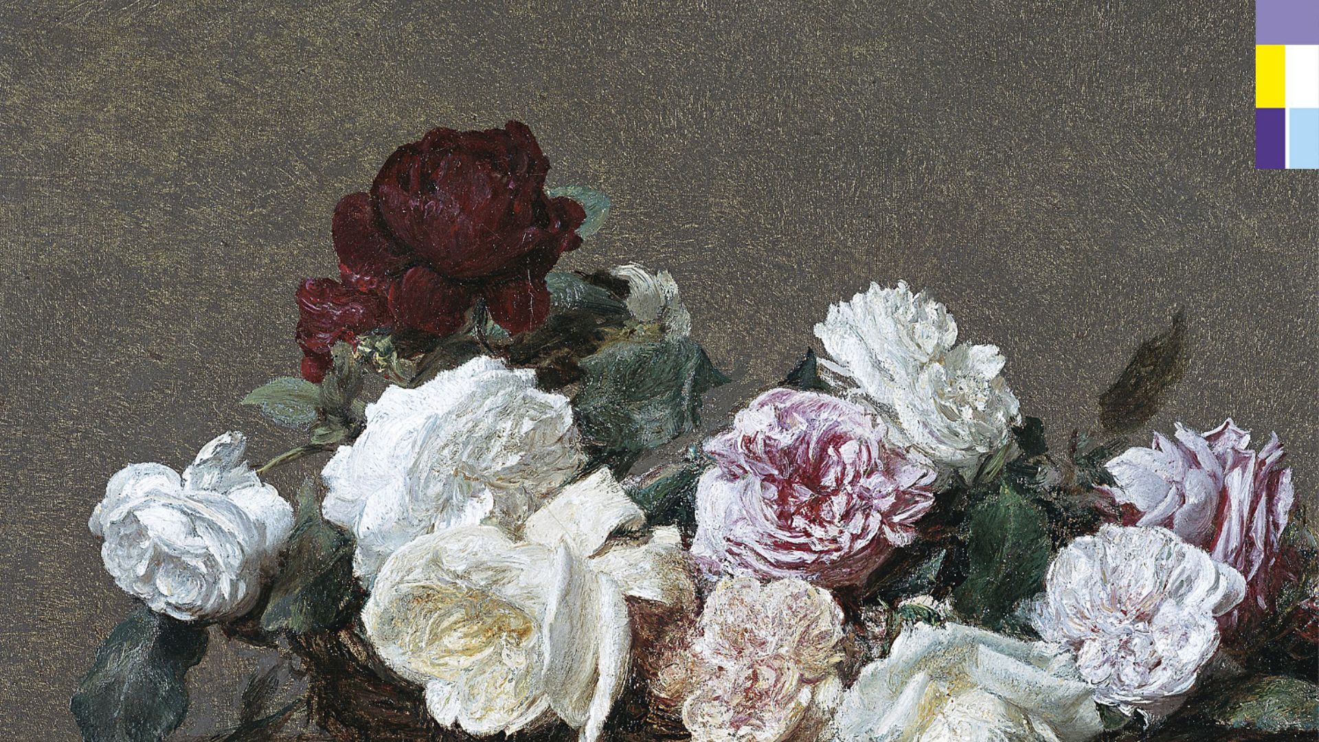
Power, Corruption & Lies — New Order
Peter Saville placed Henri Fantin-Latour’s classical painting A Basket of Roses beside a mysterious color code that represented the band and album information. The collision of fine art and modern technology was elegant, puzzling, and unmistakably New Order. It made decoding the packaging part of owning the record.
 Peter Saville, Wikimedia Commons
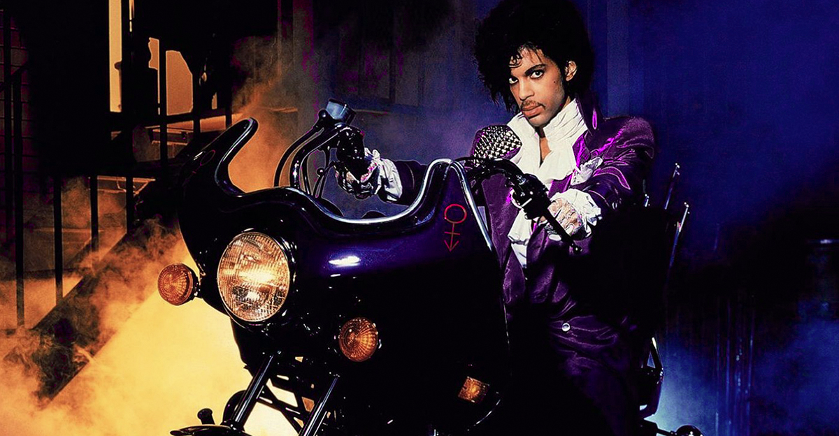
Purple Rain — Prince and the Revolution
Prince sits astride a purple motorcycle beneath glowing flowers and theatrical lighting, while Apollonia waits in a doorway behind him. The cover looks less like an ordinary photograph and more like a movie poster from a dream. Few albums have ever announced their star’s arrival with more fog.
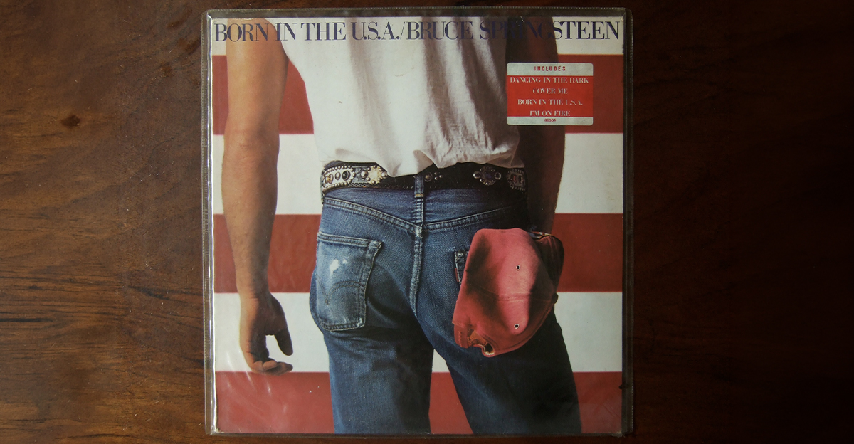
Born in the U.S.A. — Bruce Springsteen
Annie Leibovitz photographed Bruce Springsteen from behind, wearing faded jeans in front of an American flag. The image became so famous that people debated whether he was deliberately disrespecting the flag, something Springsteen denied. Whatever the interpretation, denim sales probably appreciated the free publicity.
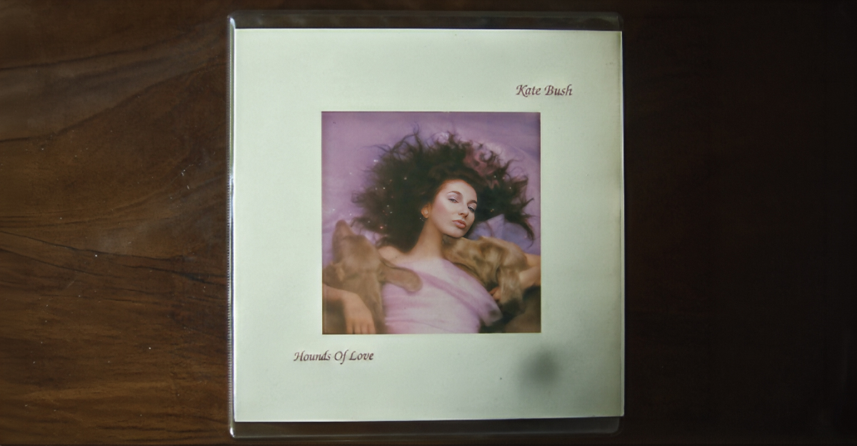
Hounds of Love — Kate Bush
Kate Bush reclines beside two sleepy Weimaraners named Bonnie and Clyde on the soft, dreamlike cover of Hounds of Love. Her brother John Carder Bush photographed the scene. The gentle image is beautiful but slightly mysterious, much like the album itself. Even the dogs look artistically complicated.
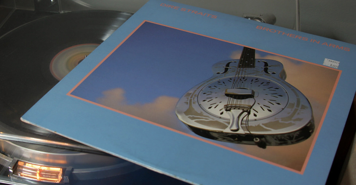
Brothers in Arms — Dire Straits
A gleaming National Style O resonator guitar floats against a blue sky on the cover of Brothers in Arms. The image is simple, but the polished metal instrument and dramatic clouds made it instantly recognizable. It also looked especially impressive on compact disc, the format this album helped popularize.
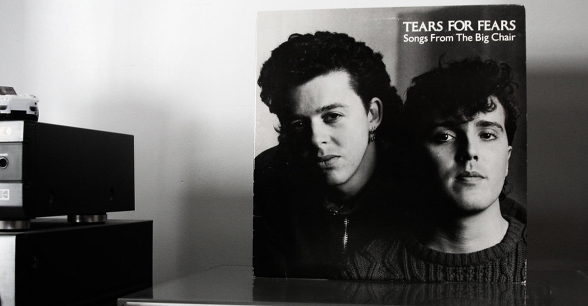
Songs From the Big Chair — Tears for Fears
Roland Orzabal and Curt Smith appear together in a stark black-and-white portrait, both looking serious enough to have just received some troubling news. The cover’s simplicity made their faces the entire focus. After years of colorful excess, two thoughtful men in sweaters could still command attention.
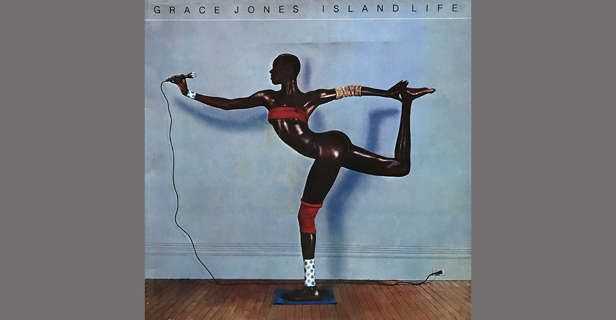
Island Life — Grace Jones
Jean-Paul Goude created the famous image of Grace Jones holding an impossible pose, with one leg extended behind her and her body forming a sharp geometric shape. The picture was assembled from separate photographs because the position was physically unattainable. Ordinary human anatomy was apparently too limiting for Grace Jones.
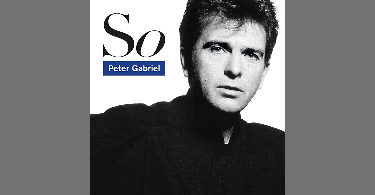
So — Peter Gabriel
Peter Gabriel’s face fills nearly the entire cover of So, with his piercing eyes and light-shadowed features creating an unexpectedly intimate portrait. Peter Saville and photographer Trevor Key developed the sleeve. After several self-titled albums, Gabriel finally chose a short name, saving record-store employees considerable confusion.
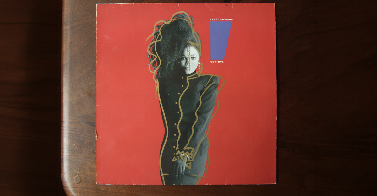
Control — Janet Jackson
Janet Jackson stands against a red background in a black outfit, staring directly at the viewer with complete confidence. Illustrator and photographer Tony Viramontes created the striking portrait. The pose and expression announced Jackson’s independence before listeners heard a note. This was not someone asking permission anymore.
Master of Puppets — Metallica
Rows of white cemetery crosses stretch beneath a blood-red sky, each grave attached to strings descending from unseen hands. Artist Don Brautigam painted the cover from a concept developed by Metallica and Peter Mensch. The image made manipulation, war, and death understandable before the needle touched the record.

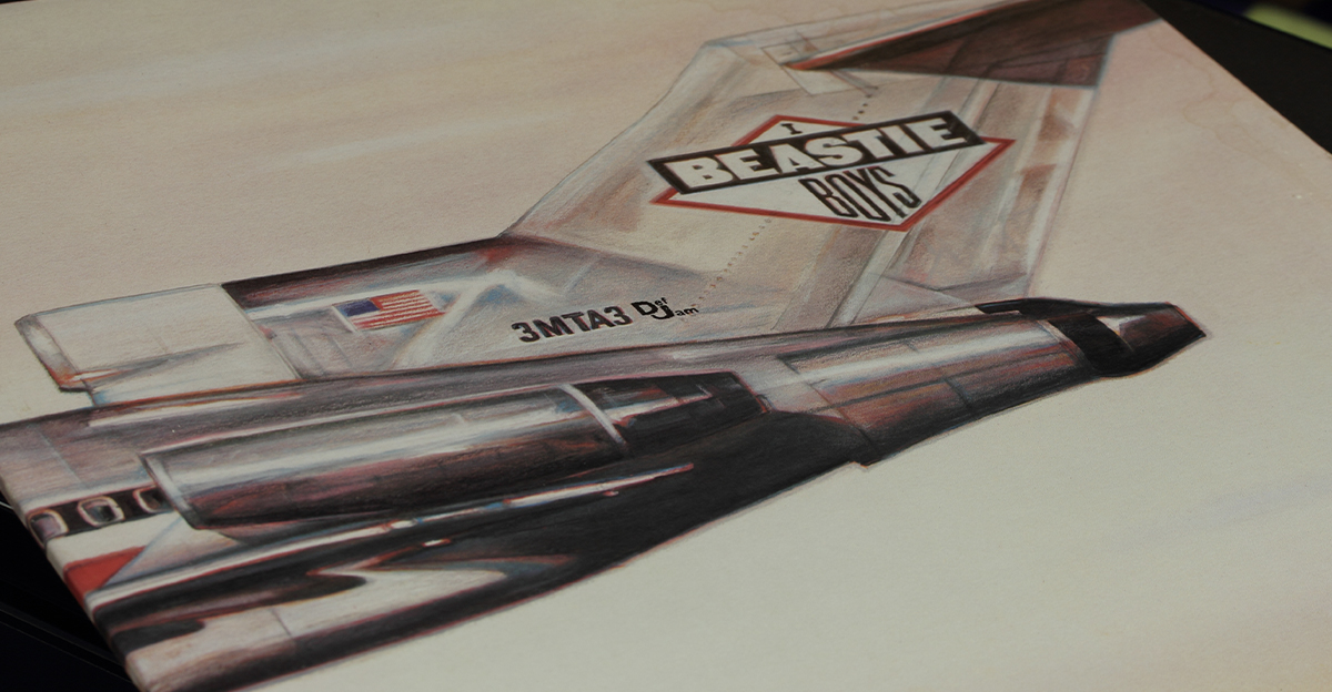
Licensed to Ill — Beastie Boys
At first glance, the cover shows the tail of a private jet crashing into a mountainside. Turn the sleeve sideways, however, and the plane’s identification number becomes a cheeky hidden message. Created by World B. Omes, the artwork combined adolescent humor with expensive-looking destruction. Very Beastie Boys.
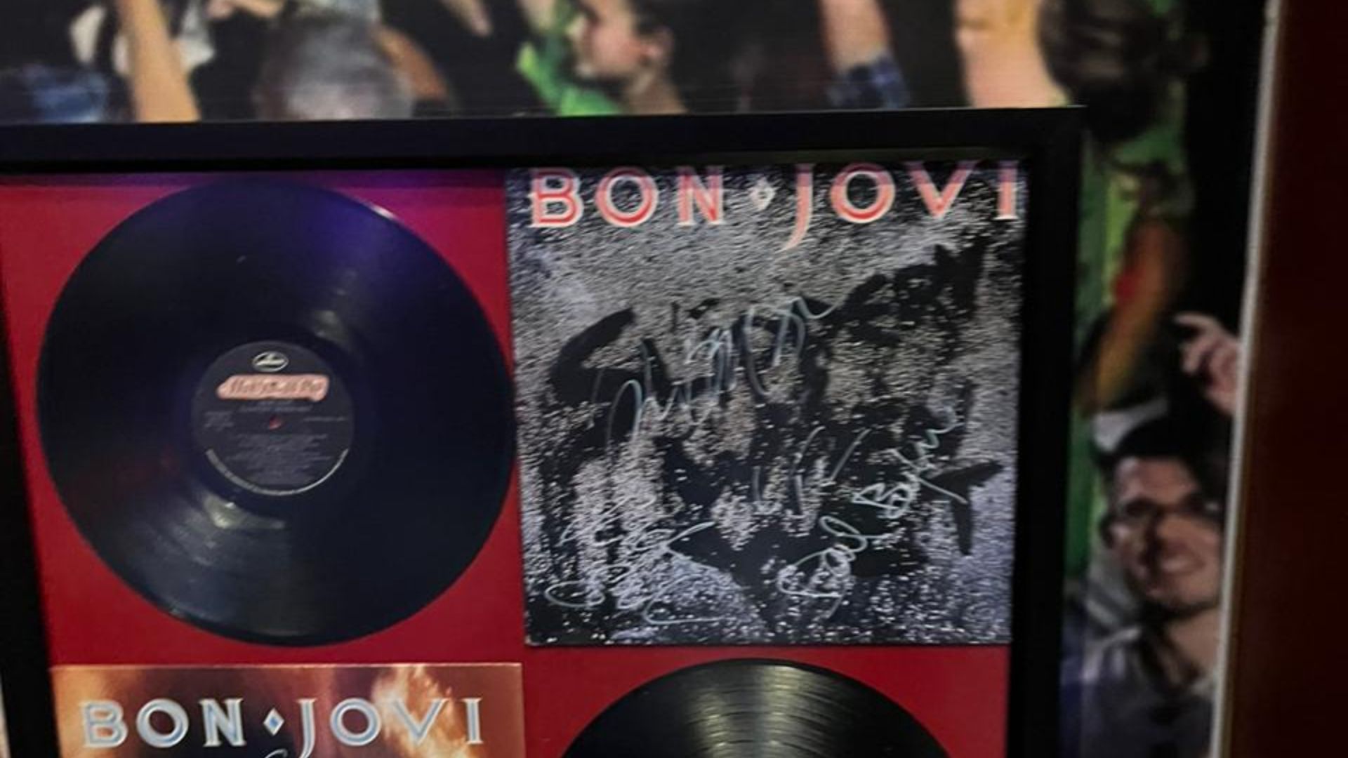
Slippery When Wet — Bon Jovi
The original cover concept featured a woman in a wet T-shirt, but retailers objected, prompting Bon Jovi to replace it with a black cover bearing the title traced through water droplets. The hurried substitute became far more memorable. Sometimes censorship accidentally gives a band much better graphic design.
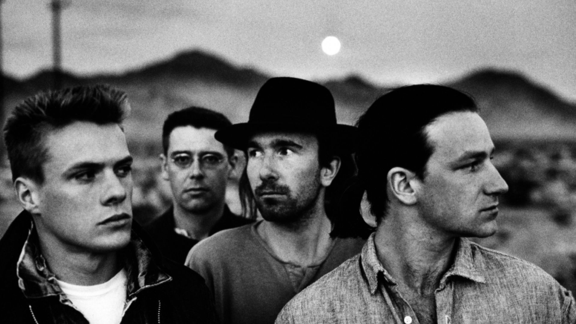
The Joshua Tree — U2
Anton Corbijn photographed U2 in the stark California desert, using wide panoramic scenery and serious black-and-white portraits. The lonely landscape reflected the band’s fascination with America’s promise and contradictions. It became one of rock’s most recognizable covers, despite featuring remarkably little of the tree named in the title.
 Anton Corbijn, Distributed by Island Records, Wikimedia Commons
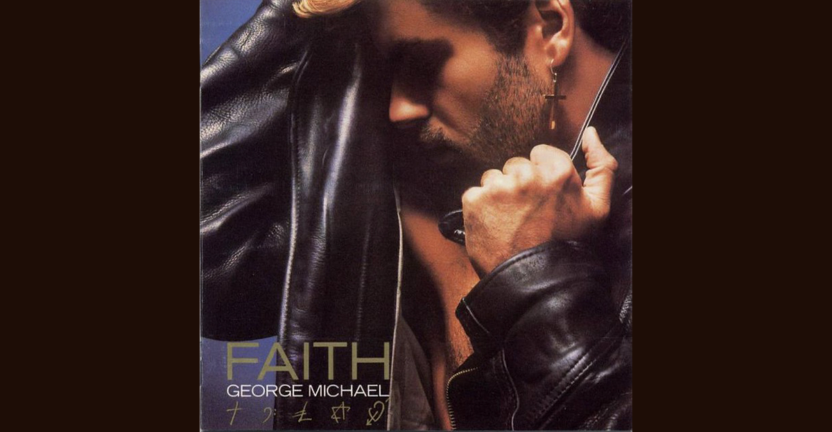
Faith — George Michael
George Michael appears in a leather jacket, stubble, earrings, and sunglasses, looking downward on the sepia-toned cover of Faith. Photographer Russell Young captured the carefully constructed new image. Symbols representing faith, music, and love appear around him, although most viewers probably noticed the leather jacket first.
Tango in the Night — Fleetwood Mac
The cover of Tango in the Night uses Brett-Livingstone Strong’s painting Homage à Henri Rousseau, featuring a moonlit jungle, distant buildings, and exotic animals. The lush fantasy scene feels peaceful until you remember the famously complicated relationships within Fleetwood Mac. The jungle may have been the calmer environment.

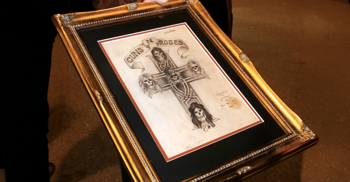
Appetite for Destruction — Guns N’ Roses
After Robert Williams’s original artwork sparked controversy, the album adopted Billy White Jr.’s cross-and-skulls design, with each skull representing a band member. The tattoo-like image became inseparable from Guns N’ Roses. It looked dangerous enough to alarm parents while remaining acceptable enough to survive in record-store windows.
 Portland Press Herald, Getty Images
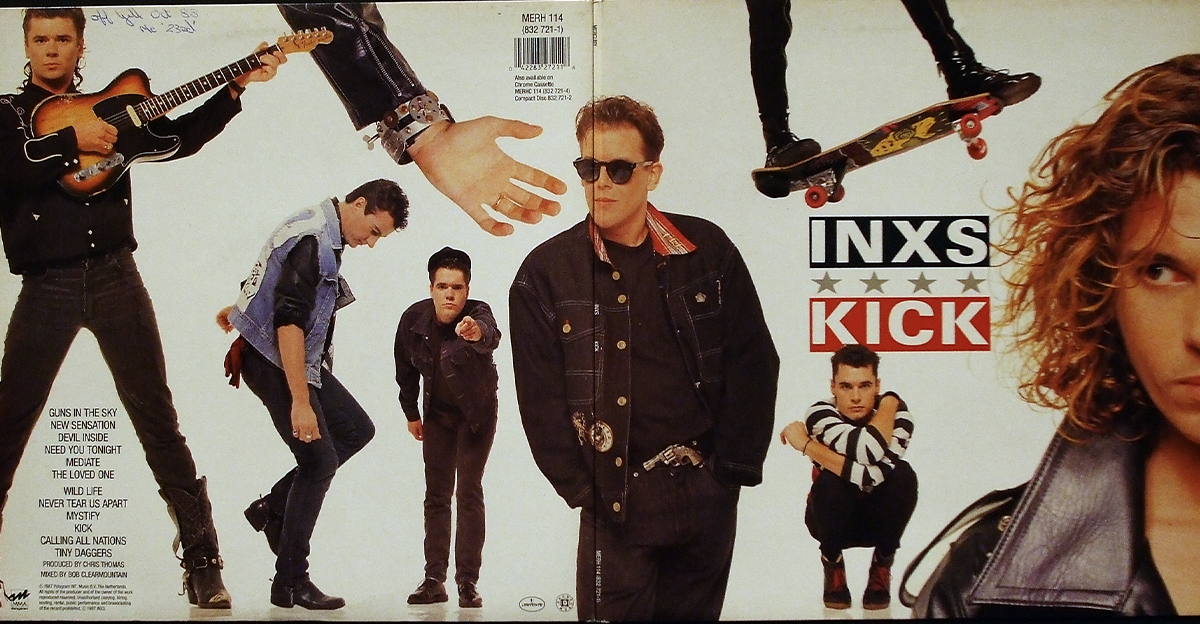
Kick — INXS
The Kick cover arranges several black-and-white performance photographs around bold red and white lettering. The sharp collage captured INXS as stylish, physical, and built for the newly dominant music-video era. It was a cover that seemed to be moving even while sitting perfectly still in a cassette rack.
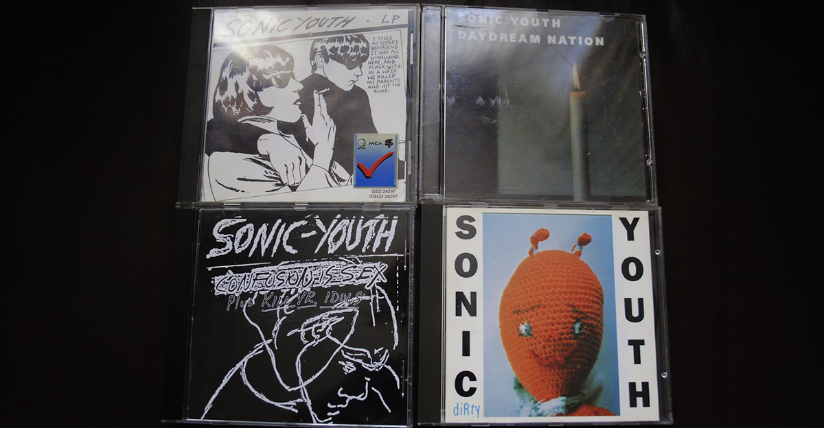
Daydream Nation — Sonic Youth
Sonic Youth placed Gerhard Richter’s 1983 painting Kerze, or Candle, on the cover of Daydream Nation. The glowing flame against a dark background looked quiet and almost traditional, creating an intriguing contrast with the band’s noisy, experimental music. True fans recognize that candle faster than most emergency exits.
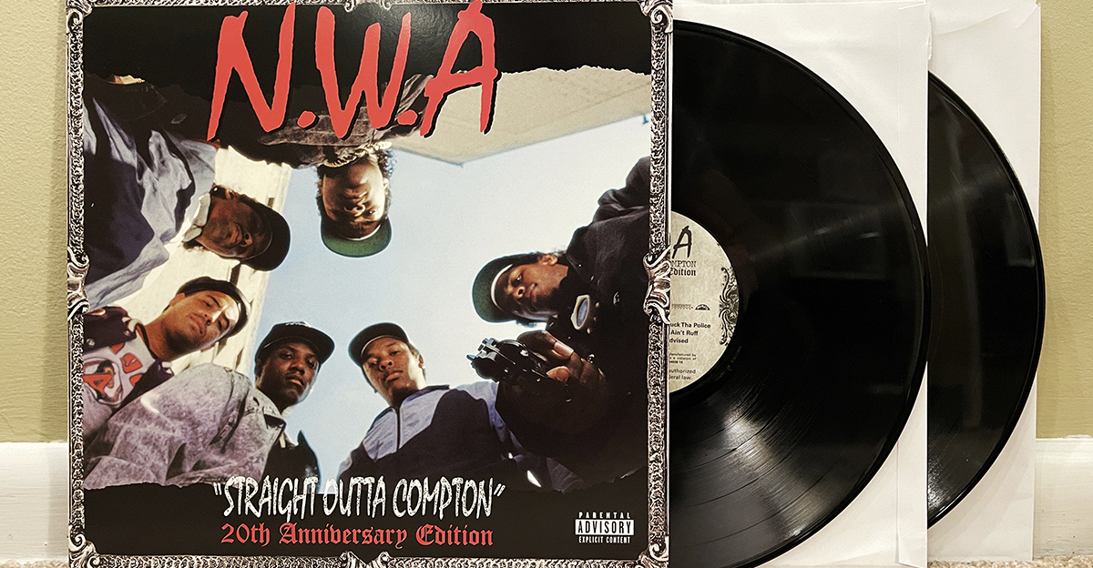
Straight Outta Compton — N.W.A
Photographer Eric Poppleton shot N.W.A from a low angle as the group stared down toward the camera, with Eazy-E pointing a gun directly into the lens. The perspective made the viewer feel surrounded and confronted. Few debut-album covers have delivered such an immediate warning about what was coming.
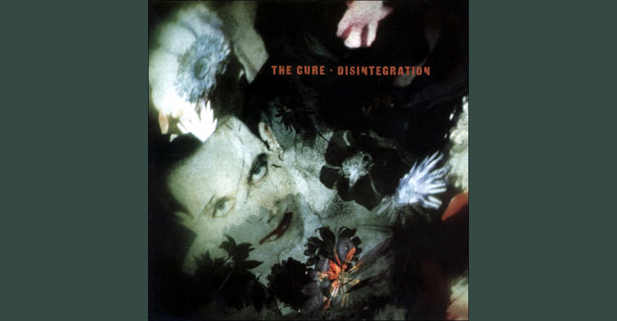
Disintegration — The Cure
Robert Smith’s face nearly disappears beneath flowers, shadows, and blurred colors on the cover of Disintegration. The band’s Parched Art team created the murky design, which resembles a damaged memory more than a conventional portrait. It perfectly prepared listeners for one of the decade’s most beautifully miserable albums.
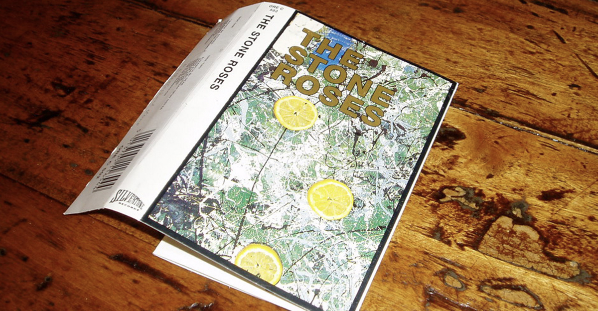
The Stone Roses — The Stone Roses
Guitarist John Squire created the cover artwork, splattering red, white, and blue paint around lemon slices. The lemons referenced stories about demonstrators using them against tear gas during the May 1968 protests in France. It looked colorful and playful until someone explained the revolution hiding inside it.
You May Also Like:
Albums That Capture The Hangover Of The 1980s
David Bowie dropped an album two days before his death—filled with clues he was dying. He passed in 2016, but his visionary legacy lives on.
Sources: 1, 2, 3, 4, 5, 6, 7, 8, 9, 10, 11, 12, 13, 14, 15, 16, 17, 18